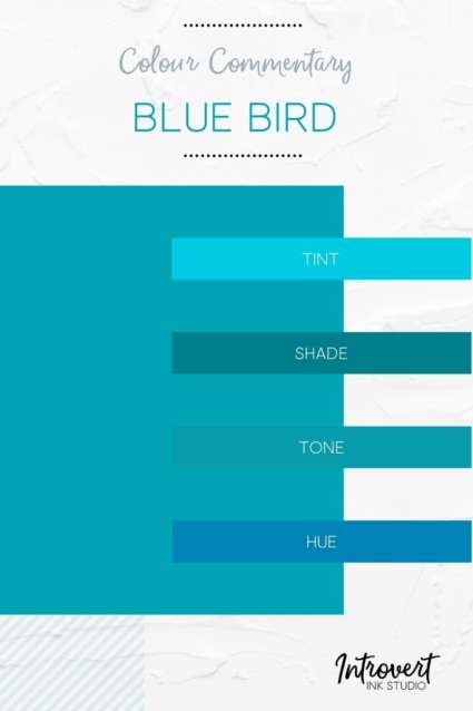
Blue is an undeniable favourite
It’s certainly one of mine – maybe even yours too. I have clothing, jewelry, furniture, art, even my hair in a past life showcasing my love of and allegiance to it.
Sadly tho, blue seems to fallen away as a viable choice for people looking to create a new or refresh an existing personal brand. This is especially true in respect to bright cueing blues and deep soulful blues.
Now I can hear you thinking, “pfft, what are you talking about? Blue is everywhere.” Yeah, yeah, but tell me about the “everywhere” you are looking at the most when it comes to brands? Is it your phone? Mmm.
For a really long time blue has been the branding domain of technology and commerce companies.
In the early big tech days, IBM hit with a distinctive blue logo and has been known as”Big Blue” every since. Samsung came along, Dell, HP, etc etc. Apple and Microsoft resisted and came with a rainbow to compliment the blue but it was still there.
 Banks, airlines, and so many other white male-dominated pillars of commerce also latched on to blue. Then the social media mammoth hit–you know which one–and every social media and app since runs towards blue as a colour saviour. I’m aware of at least one successful design company who only works with blue for their tech clients. How very one-dimensional, right?!
But why is this?
I have no definitive answer. Colour psychology will tell you it’s because blue is considered dependable and trustworthy. Okay, those are good qualities to represent for a business; I can’t argue against it. But wouldn’t such qualities implied for a personal brand too?
Allowing a colour it to be colonized for singular business purposes and contexts is just … sad. Blue deserves better. Maybe it even deserves you!
If blue is a favourite of yours but you feel you can’t or shouldn’t use it – STOP. Yes, you can. Yes, you should. And here’s why –
No colour is a stand-in for YOU.
A brand saturated in blue may visually communicate dependability but if YOU constantly miss deadlines no one will think YOU dependable and consequently your brand and your business. Same with being trustworthy. Blue still carries the connotations of dependability and trustworthiness regardless of who or what it is positioned in alliance. It may hook people to take a longer look but you, your products, your services, whatever are what keep them on the line.
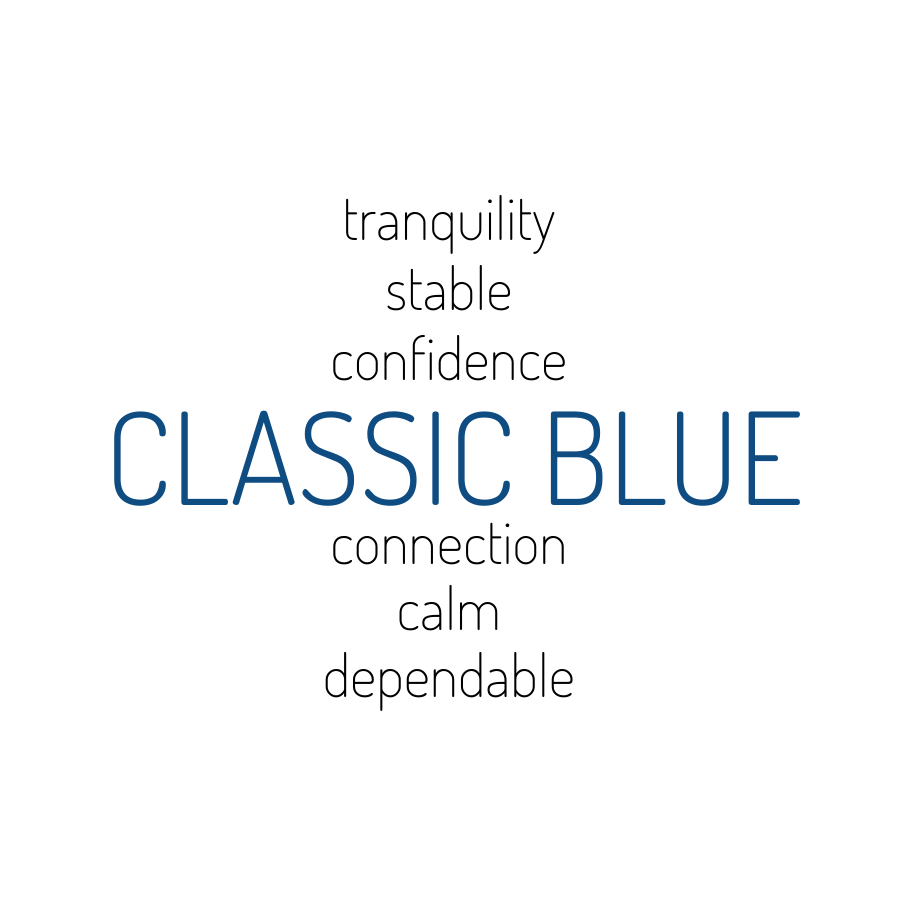
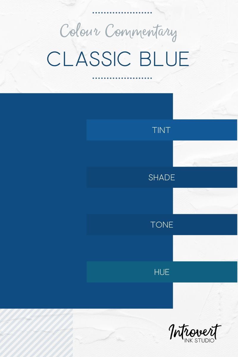
So wrap your brand up in blue if that is what you want. Maybe even try a deep, soulful classic blue. It’s stylish without being an entire style. It’s bold without needing to be the centre of attention. It’s class without being classist. What else could you want?