That’s ‘blue’ not ‘big’
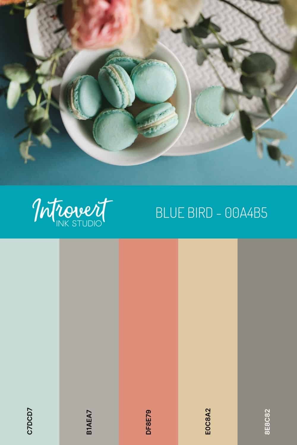
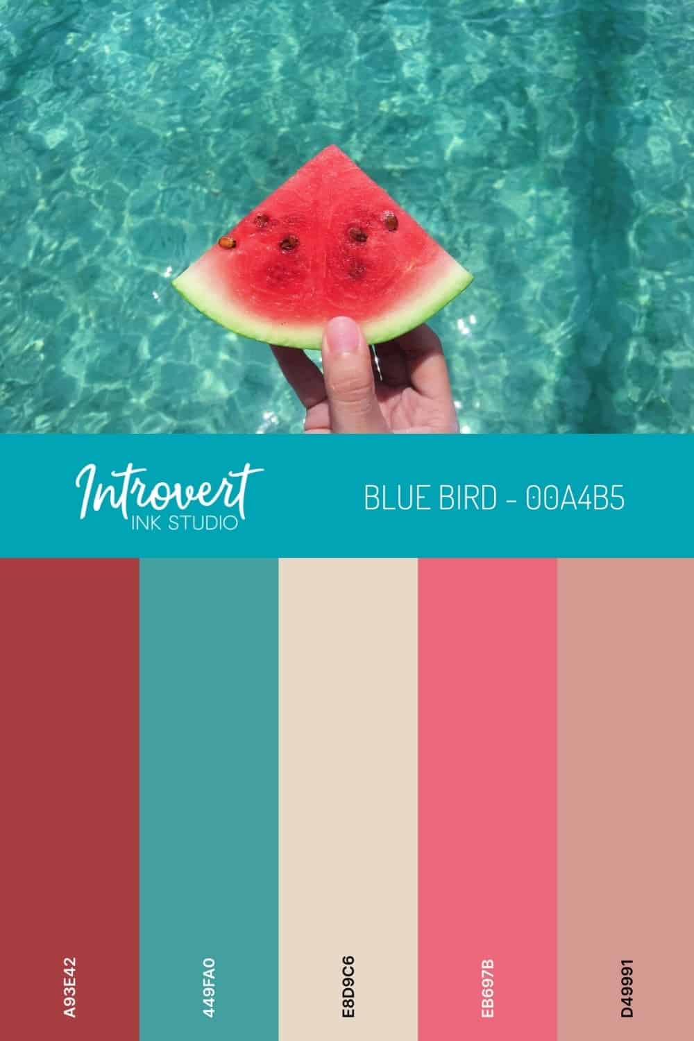
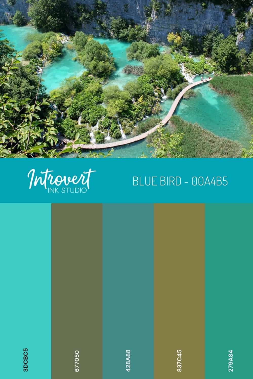
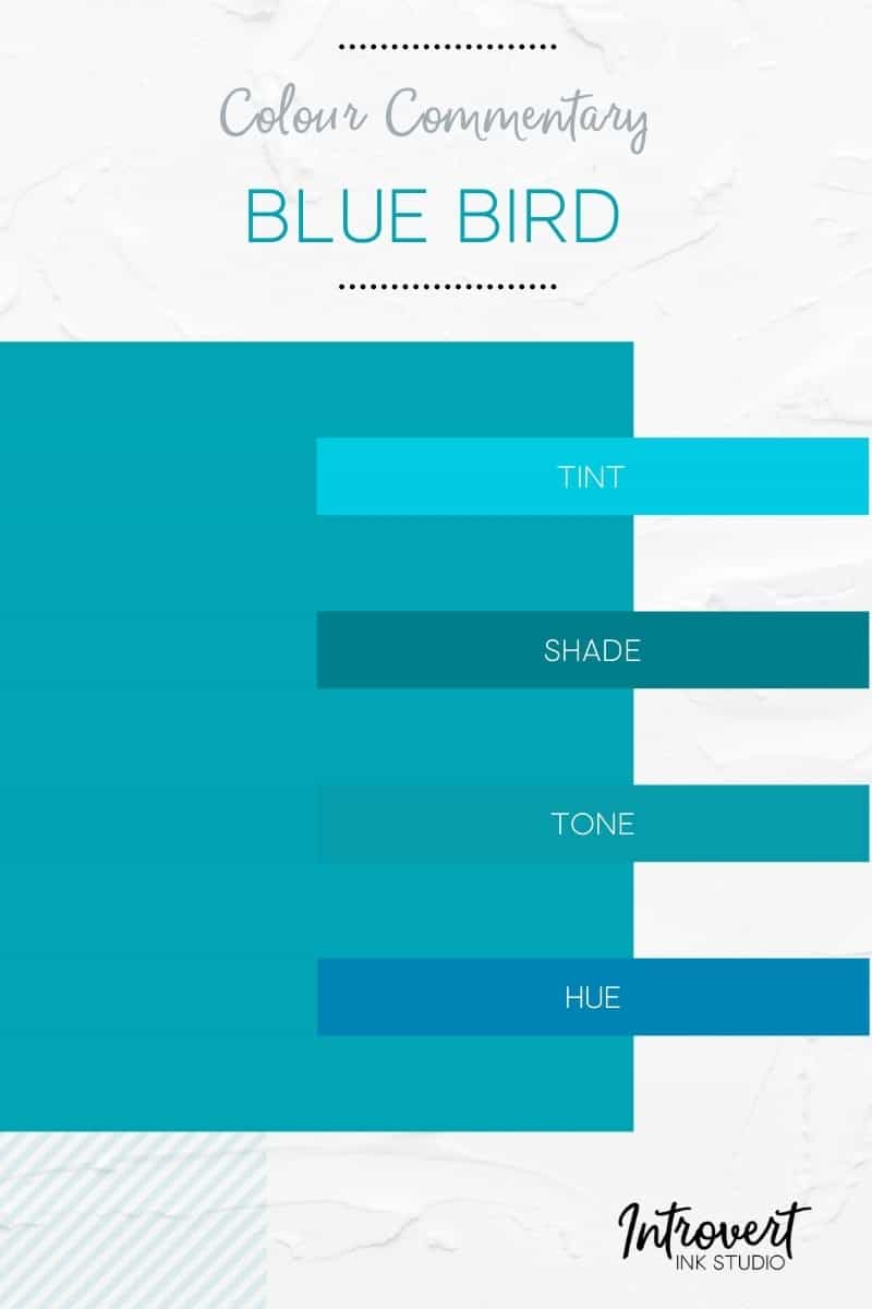
Blue Bird is a fantastic name for a colour because it fixes itself to a known element – “oh look at the blue bird!” Granted, you’re not likely to see birds this colour unless you are in Southern Africa (blue waxbill) or India (blue robin). It’s more likely you’ll see birds rockin’ a Classic Blue or a related shade than this Pantone ‘blue bird’ if you’re elsewhere. But the sourcing is still apt as everyone who has seen a bird of any kind has a frame of reference.
This particular colour vibrancy is sometimes referred to as Pacific Blue as well. Again, a great name for a colour because it has an embedded call to action to ‘picture’ the Pacific Ocean. In our experience, this isn’t the blue we would associate with the Pacific but given that it is 155 million square kilometres long and 4,000 metres deep who are we to argue the association.
Anyway, we haven’t lost the plot here, we promise. What we’re getting at is that Blue Bird is more than a colour. It’s almost a state of being. It can stand-in for parts of you unknown or unseen, just like it does for parts of the ocean or a real bird. You can think of it as a submark of a brand; it’s still on brand but has its own style and presence.
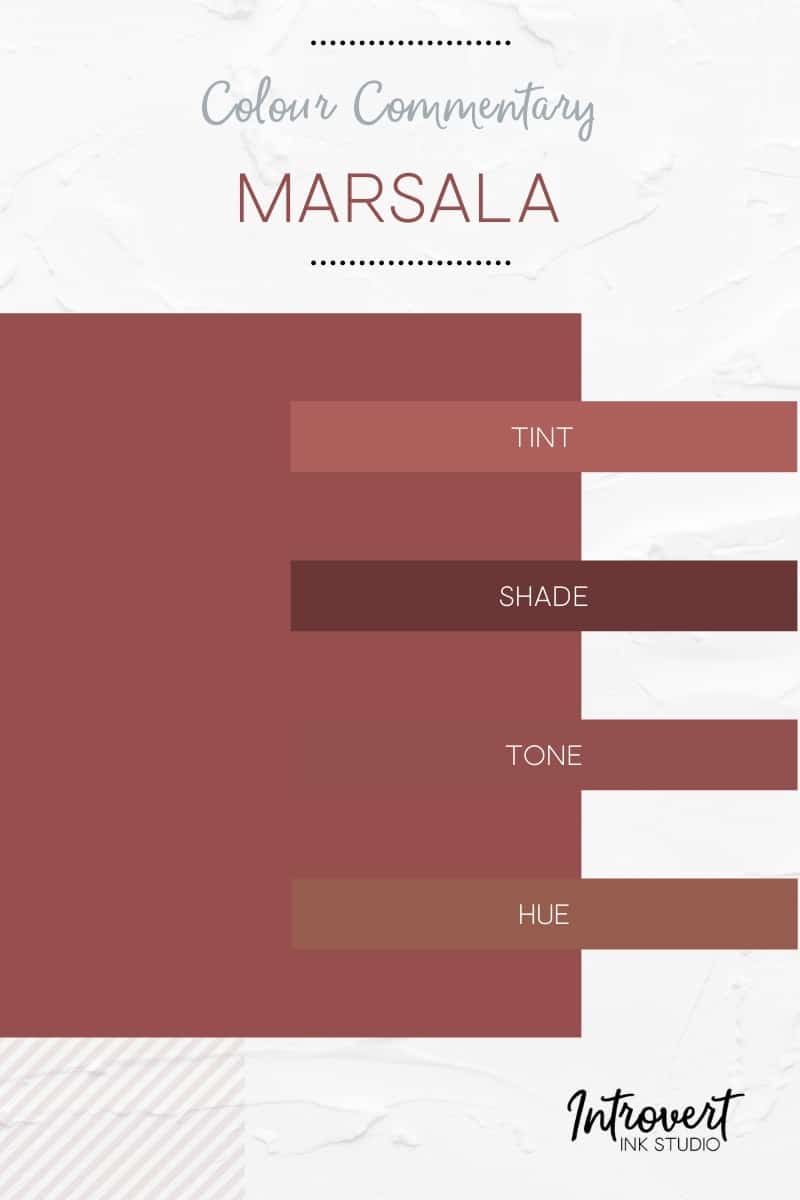
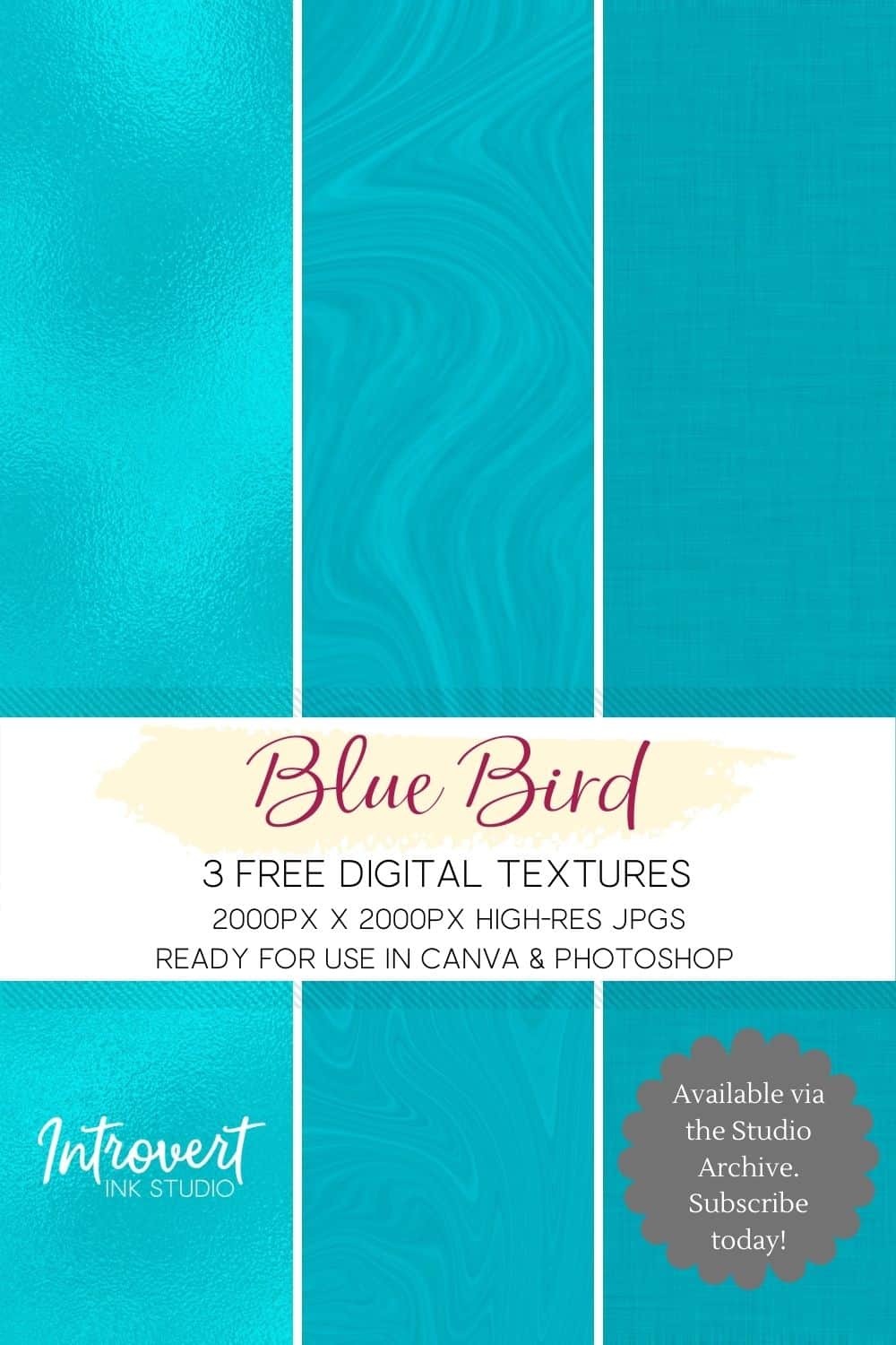 Colours like Marsala and Classic Blue are what we like to call stationery. They look great and tell a story in place but not necessarily in movement.
Blue Bird is assuredly not a stationery colour. It is meant to move, to be moved, to be in motion. Even if it is used for a static element such as pillow or even a necklace the enigmatic nature of the colour suggests a sense of action and movement.
This is because Blue Bird doesn’t need your attention; what it wants is your engagement. It wants your involvement. It wants activity not passivity. Blue Bird wants you to dip a toe into it.
This makes it an orthodox colour for a brand because while it exists within the spotlight it doesn’t consume the entire spotlight. Blue Bird is a sharing colour and becomes fully realized in the act of sharing whether it be with you or for you. In contrast, Pink Lemonade consumes the spotlight and creates a new one.
Additionally, nothing about Blue Bird is false or vulnerable or uneasy. For brands wanting to avoid such categorizations, a sharp confident colour like Blue Bird may be a winning component. It’s confidence is seamless and its influence is calming. Who wouldn’t want the same to be said about their brand?
For your brand consideration ...
Blue Bird
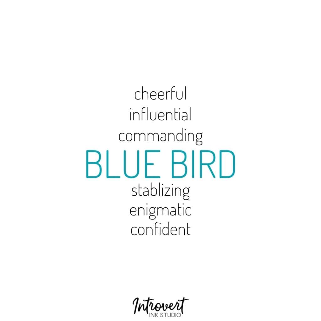
Colour Codes
HEX #00A4B5
RGB 0, 164, 181
CMYK 100, 9, 0, 29

