Mango is a feast for the eyes
Okay, we have to be honest with you upfront: mango is not a favourite of the fruits over here; feelings run strongly to the opposite end of the likeness scale. As a colour, however, we’re firmly in the chorus of “yes, please!”

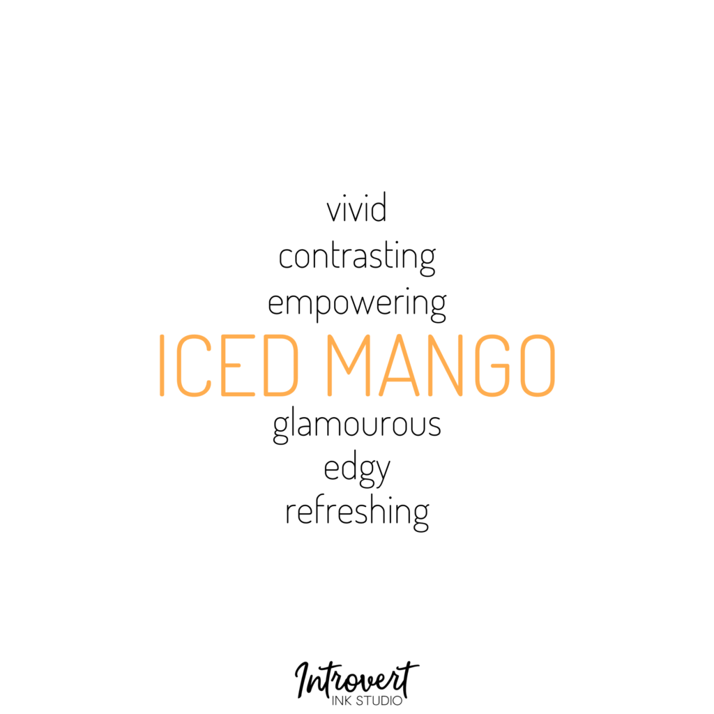
Just look at it. It’s all kinds of lush and plush with a rich youthful dynamism. It makes you want to touch it, feel it on your fingertips. It makes you want to smile. Even if you’re only smiling on the inside. Which is kind of like a mango; a blending colours and moods on the outside and a burst of orangey pulp just underneath.
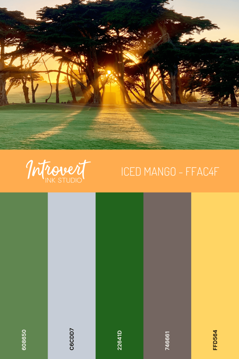
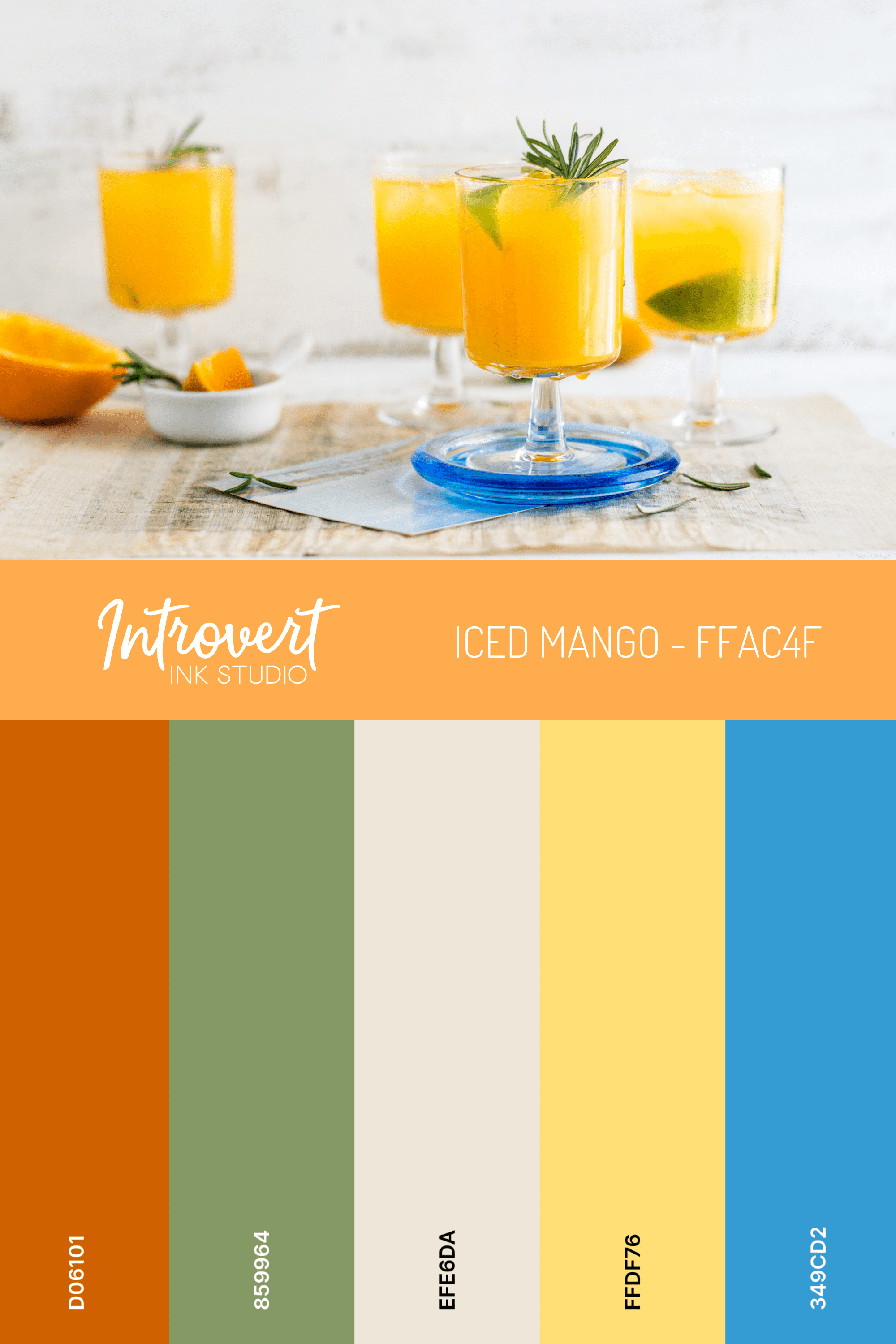
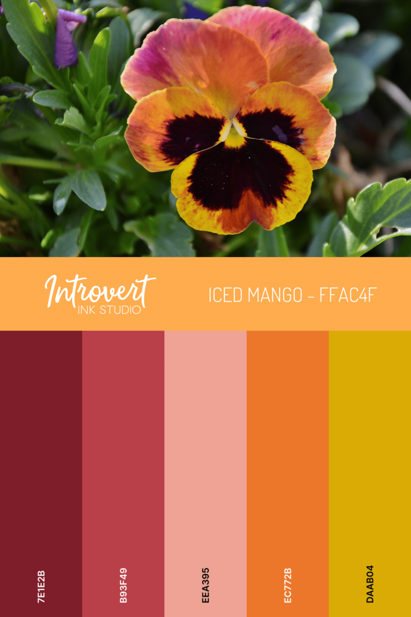
For branding purposes, iced mango works incredibly well with deep shades and dark neutrals. Use it in a more submissive role as a foundational colour rather the focus. It offers brightness to liven up its colour colleagues but without unbalancing the the colour harmony.
Or go the other way and surround it with pure neutrals and other vibrants to let it shine like a jewel. This approach offers iced mango up as a swirl of understated glamour or intensity. Your eye can’t help but be drawn to it no matter the configuration you place it within.
What else can we say? Just LOOK at it. It’s a cool refreshment on a hot day – refreshing and desirous.
For your brand consideration ...
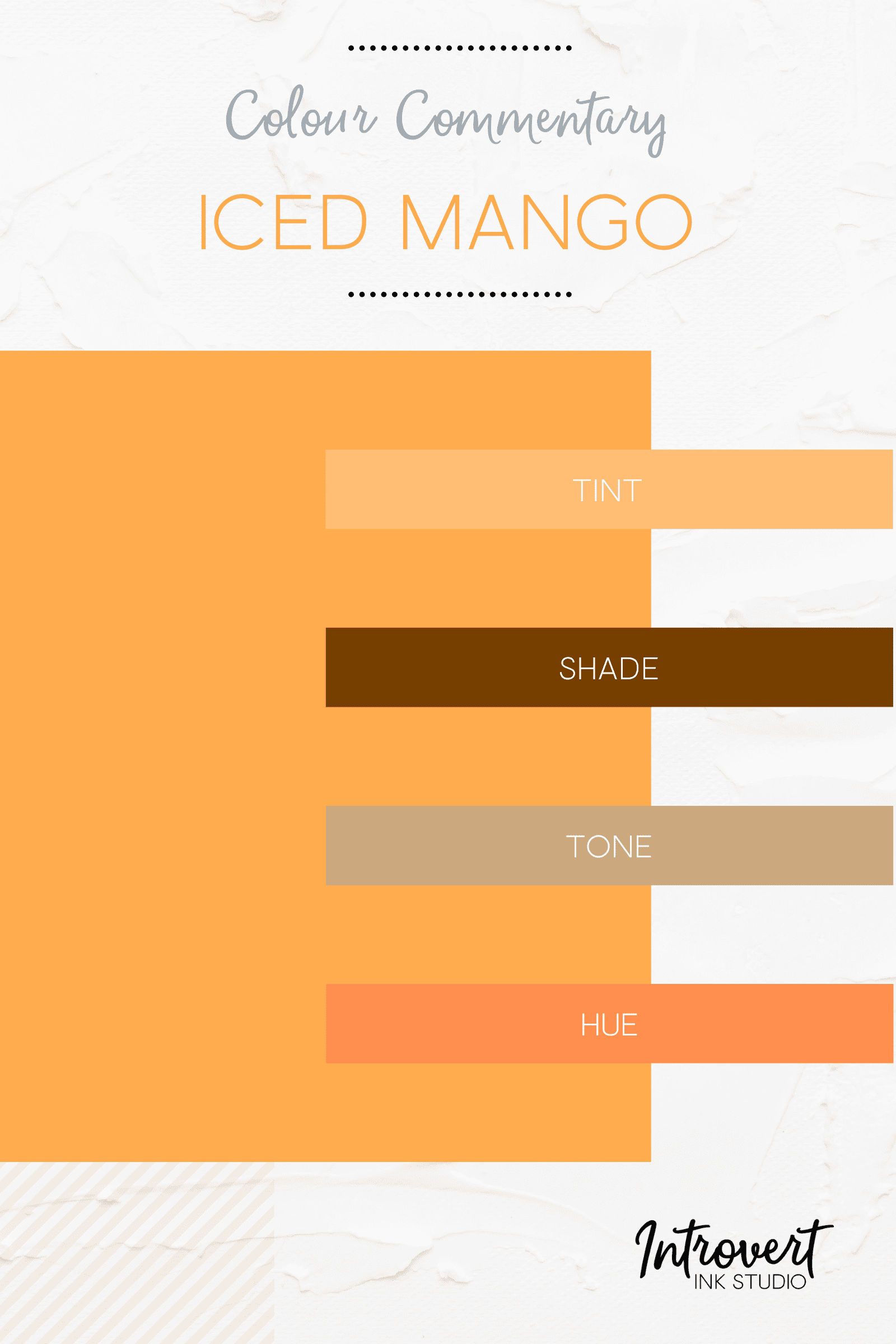
Iced Mango
Colour Codes
HEX #FFAC4F
RGB 255, 172, 79
CMYK 0, 33, 69, 0

