Brand and Website Design
Outside the Pod
‘be curious. make an impact.’
Outside the Pod was born of a desire to address skill gaps existing within the consulting world that no one was talking about yet everyone was experiencing. Conceived as a learning and coaching portal, Outside the Pod strives to offer unique resources and services to ‘pull up’ anyone wanting to further their professional development in new ways.
Design inspiration
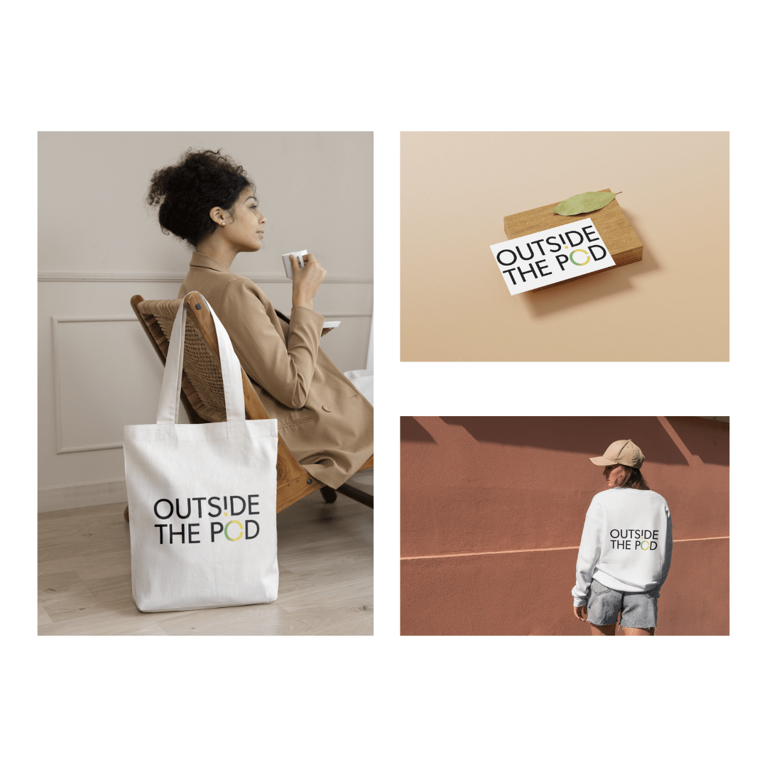
Outside the Pod wanted a representation that was clear and simple with a bit of fun rolled in.
The approach was to create a standard typography business logo, then play off the “outside” element through the letters. We first do this with the ‘hole punch’ effect within the second “O”, creating the sense of something missing. This is then emphasized with the missing hole punctuating the upside “i”. The whole composition is a simple yet creative take on having to be part of something (a pod) but forging your own path within it.
brand characteristics
authoritative, flexible, playful
music influence
Sloan, “Money City Maniacs“


“
[The Studio] always does an awesome job. I am always impressed in how she can translate an idea into function. She made a site that beautifully explains and shows who we are as a business and what we want to promote … wellness.
I love the final products!


